
Charts are essential to the technical analysis of futures, stock, and crypto markets, as they provide the necessary foundation for all study. They are used to display price developments visually and form the backdrop against which you can place various indicators to help you make a decision.
You can construct charts to display different time ranges in different visual styles. Depending on the horizon of your operations, you can choose to study different charts representing several time ranges. A long-term trader might follow a price on a 1-week or 1-month chart, while a shorter-term trader might choose 60-minute or 5-minute ranges.
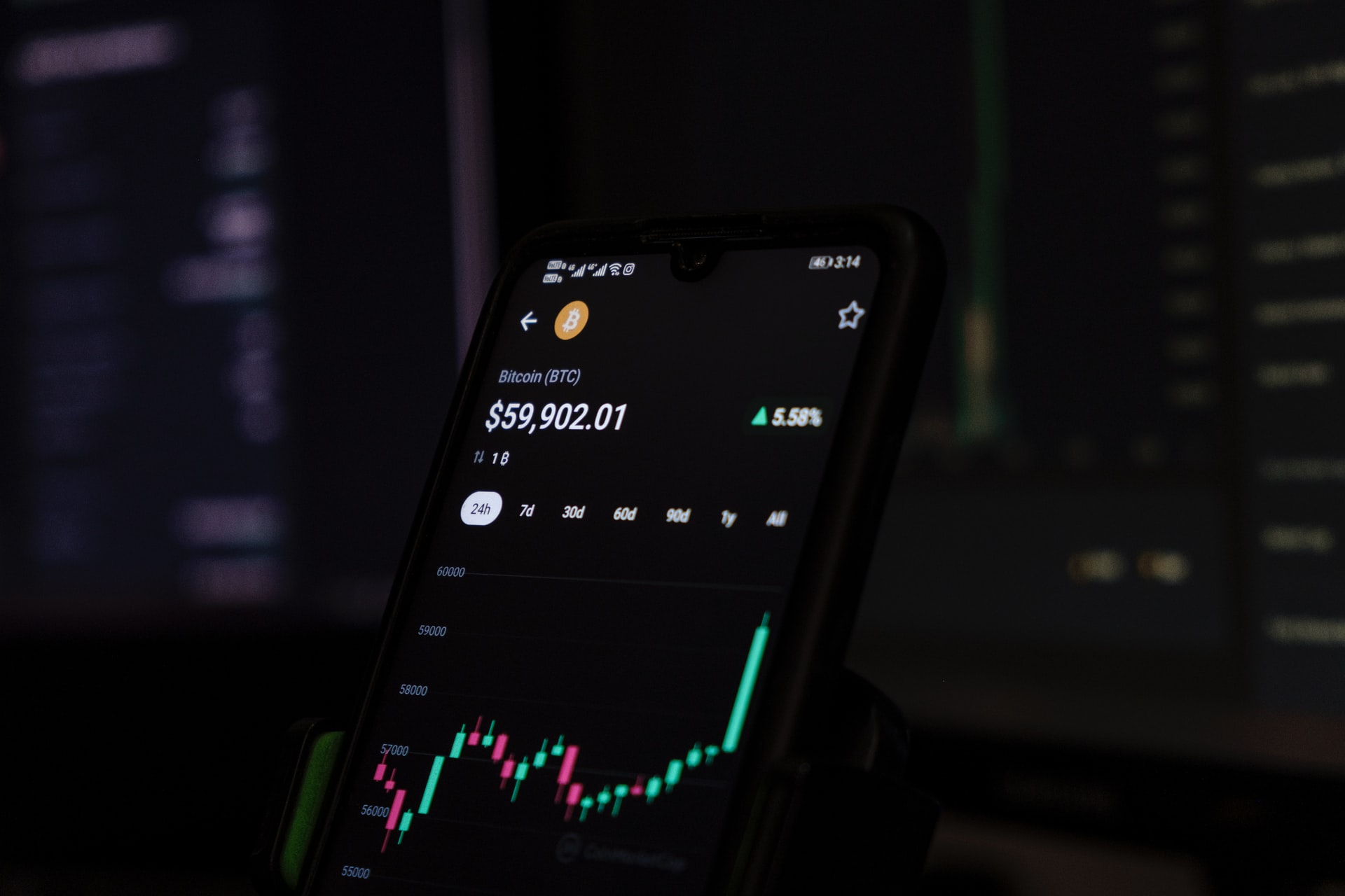
There are many ways to organize charts and visual representations of prices. The most common charts are candlestick, bar and line charts.
Regardless of type of visual representation used, candlestick, bar, and line charts allow the trader to identify:
- the presence of a trend in the market
- reversal signs during market highs and lows
- periods of consolidation
Candlestick Chart Patterns
The candlestick chart visualizes a price divided into two main parts: the candle and the wick. Put together, these two parts look like a candlestick, hence the name of the chart. One of the most famous is the bear flag pattern.
The wick, shown as a thin line at the top and bottom of the candle, indicates the maximum and minimum prices traded during the defined time frame. The body of the candle, which corresponds to the thicker central part, represents the opening and closing prices over the time range considered.
If the closing price is higher than the opening price, the bar is usually colored green, depending on your software’s color settings. If the close price is lower than the open price, the bar is usually colored red, depending on your software’s color settings.
Example
The 5-minute chart for E-mini S&P 500 (ES) futures shows that the open price of the bar is higher than the close price because the bar is green.
Using the Candlestick Chart Pattern
Candlesticks provide traders with two ways to visualize buying and selling pressure.
First, the size of the candle represents the intensity of buying or selling. The longer the candle, the more the price has moved up or down over the time frame considered. A short candle body means that the open and close prices were very close, and therefore the price movement was not very strong.
Second, the size of the wick relative to the body is important. A candle with a short wick, or no wick, means that the price movement has been strong towards the close, and that either the buyers (green candle) or the sellers (red candle)have dominated over the whole period. .
If the wicks are elongated, they represent a multiplicity of trading prices, with dominance of both buyers and sellers.
The candles can also indicate who was dominant at the close of the bar. If the candle has a small body near the bottom of the bar, it means that at the time of the close, the sellers took control over the buyers, who were dominating at the open.
If the candle has a small body near the top of the bar, it means that the buyers have taken control over the sellers at the end of the period.